Shopping carts are possibly the most important part of your ecommerce store.
You’ve already got the customer.
They’re ready to invest.
And then they get to a clunky, painful check out process.
Don’t be that guy.
Don’t be the store which turns away customers in droves.
This blog will guide you through the process of three easy to use checkouts.
Expect loads of helpful pictures, a pinch of inspiration and a hunk of motivation to get your online checkout process streamlined.
Why is the shopping cart process so crucial?
Let’s not overcomplicate things here. The shopping cart process is where the transaction takes place, which means satisfied customers and dollars in your pocket.
Simple, right? Everybody wins.
After doing the legwork to get to the checkout, why on earth would someone abandon a purchase they are milliseconds away from securing?
But alas, the online shopping cart is rarely a friction-free experience. Difficulty ensues and doubt creeps in. Psychological barriers pop up unannounced. Nobody feels like punching in their card details if it has been an arduous, cumbersome and downright confusing experience from the get-go.
Abandon carts = lost revenue.
The concern for ecommerce retailers is that the global shopping cart abandonment rate appears to be on the rise.
 Image via barilliance.com
Why do people abandon online shopping carts?
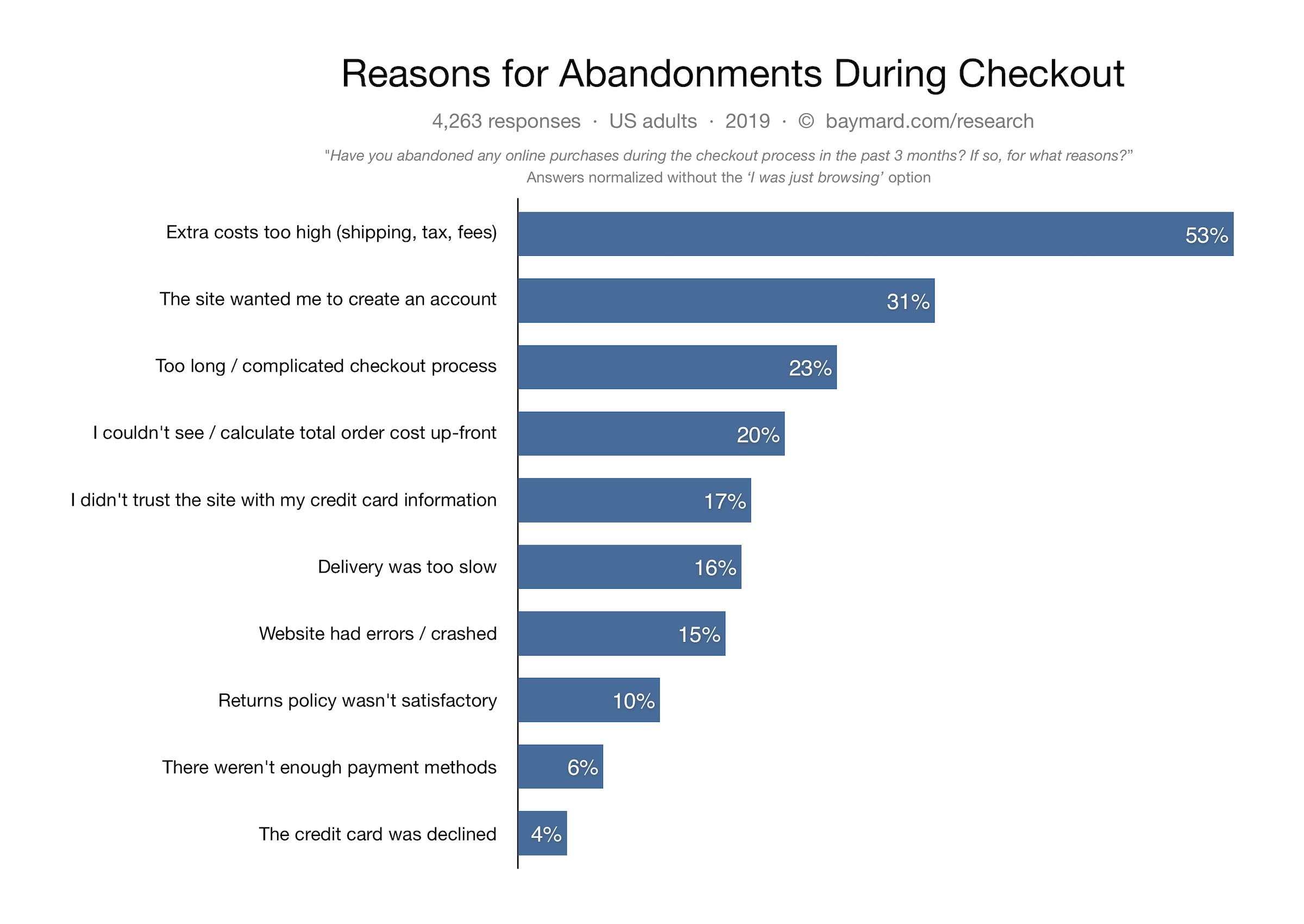 Image via baymard.com
The data above is from a US sample taken in 2019, providing some very valuable insights into why shoppers pull the pin prior to purchase.
It’s no surprise that tacking on unexpected fees during the moment-of-truth was considered the number one deal breaker. No-brainers like being unable to easily calculate a total cost and website errors are concerning to see on this list. These are retailer-side problems that can usually be fixed quickly and easily.
The online shopping cart is your final opportunity to provide a value-add to your customers until they return. A negative experience here can sour a great deal, so be sure to knuckle down and create a superb shopping cart experience.
Let’s examine some of the finest online shopping cart examples to see what makes them a cut above the rest.
Milligram
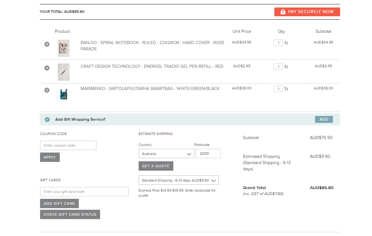
Milligram are a boutique Australian stationery retailer with a simple, intuitive ecommerce checkout process.
The customer’s information is laid out in a logical hierarchy, without becoming overwhelming. Milligram have done a great job of condensing the essentials, with plenty of white space and strong, simple colours used to direct attention.
Bonus points awarded for:
- Easy quantity update functionality without leaving the page
- Notification of remaining spend required to qualify for free shipping
- Coupons, gift cards and shipping calculation are a piece of cake
- No confusion regarding order total
- Variety of payment options
- Order can be completed without creating account
- Address checking function confirms postal address if it looks incorrect
- Address and payment method are divided into two columns, making the overall process feel less daunting
Everything you need to complete the order is presented in two elegant, minimalist shopping cart pages. The quick edit options for your order are excellent and the order info is front and centre at all times to minimise confusion.
PetBarn
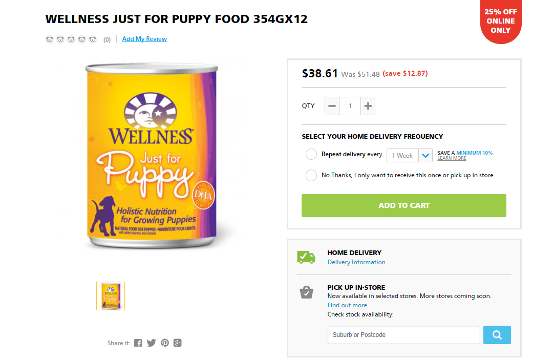
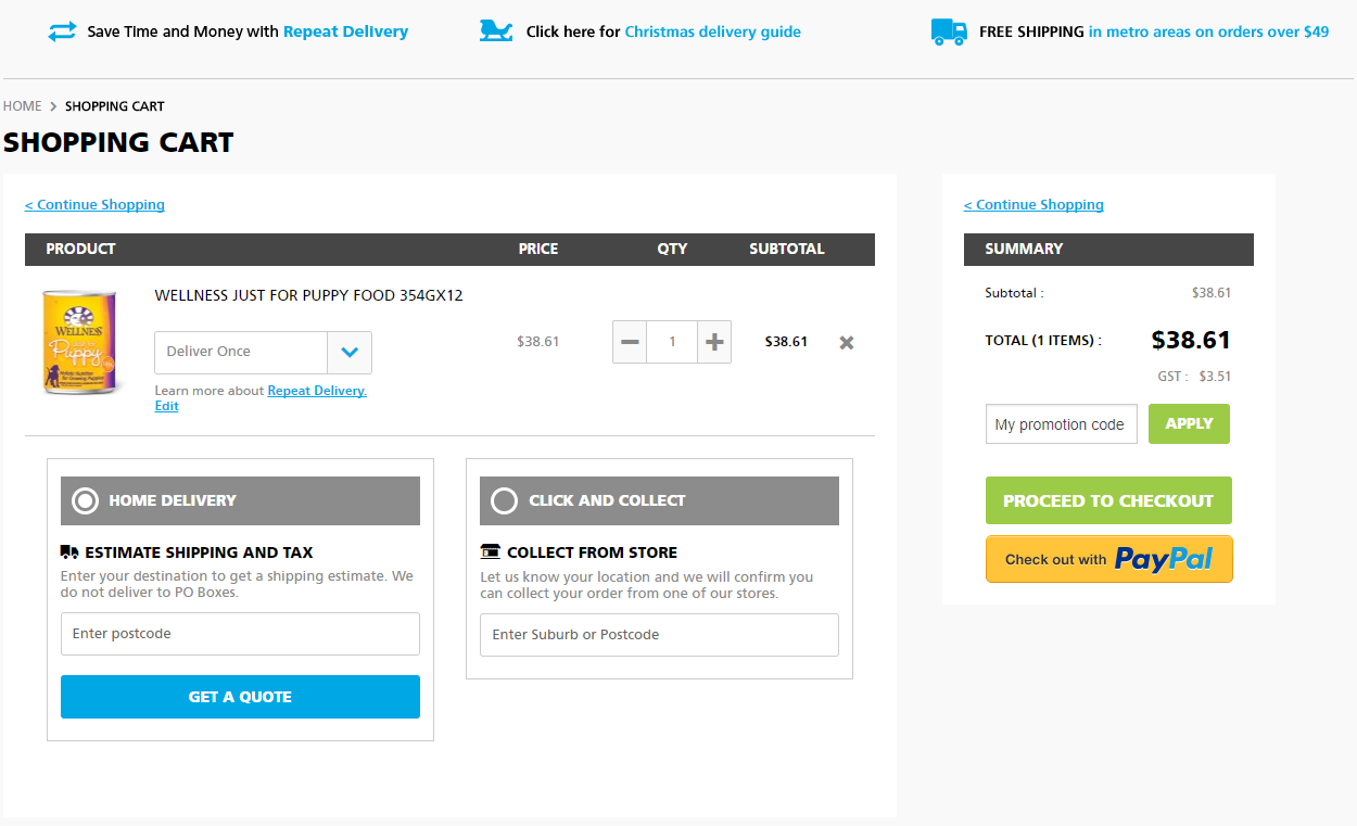
First and foremost, the PetBarn online shopping cart process is easy on the eyes. Product zoom allows for closer inspection of labelling, plus you can see exactly how much you are saving by shopping online (winning!).
Product ratings appear directly above the item for social proof and the entire process is separated into clearly labelled stages.
PetBarn offers personalisation throughout the shopping cart process which is a real bonus. Customers are given the opportunity to:
- Choose from home delivery or pickup at their local store (postcode lookup functionality)
- Arrange repeat deliveries of the same order at specified intervals so you never run out
Lorna Jane
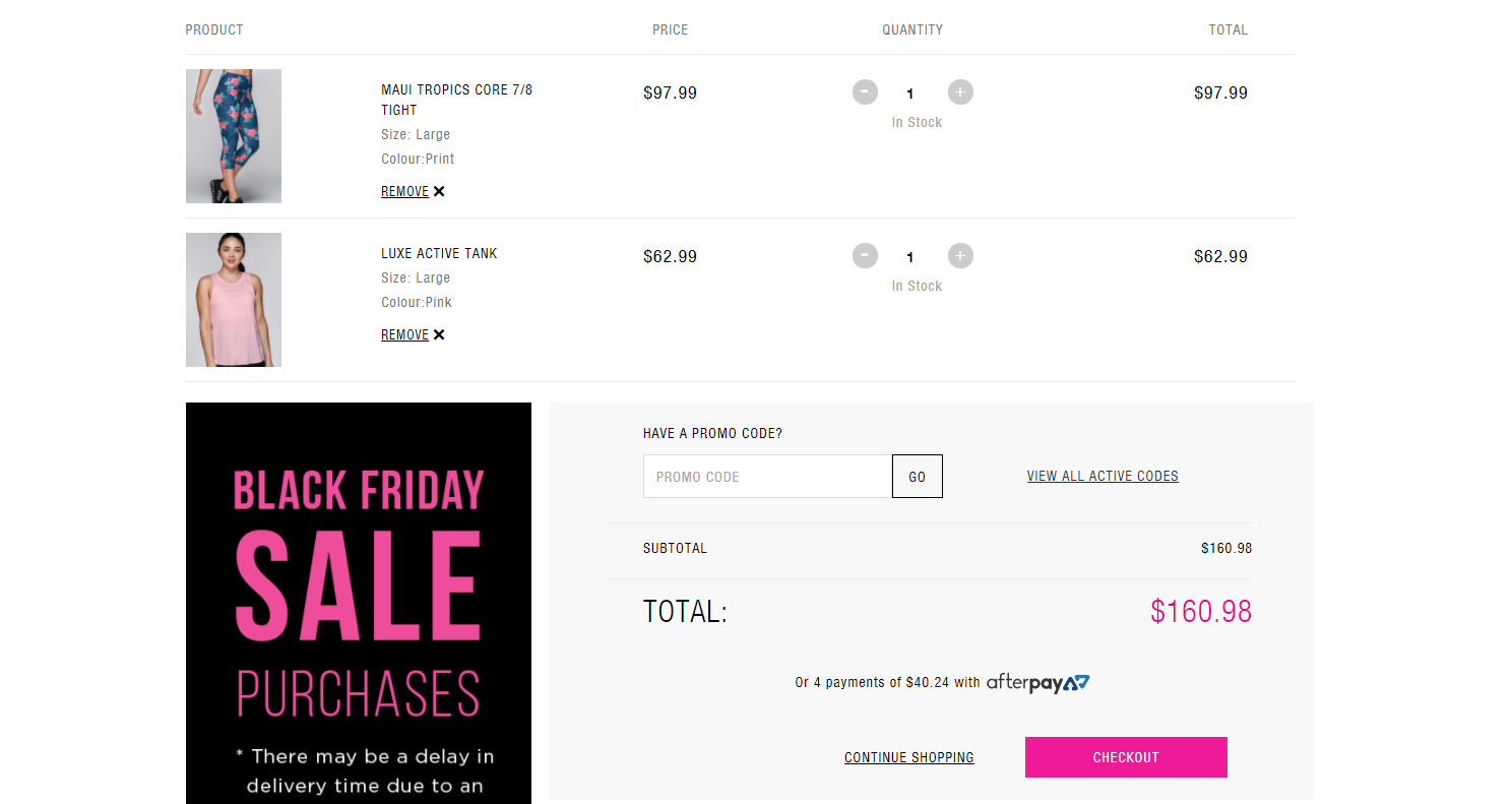
Lorna Jane’s online store makes things super simple for browsers to convert without any hassle. Each item has a ‘quick buy’ hover-over button, sending that product directly to your shopping ‘bag’ or wishlist without a fuss.
Image: lornajane.com.au
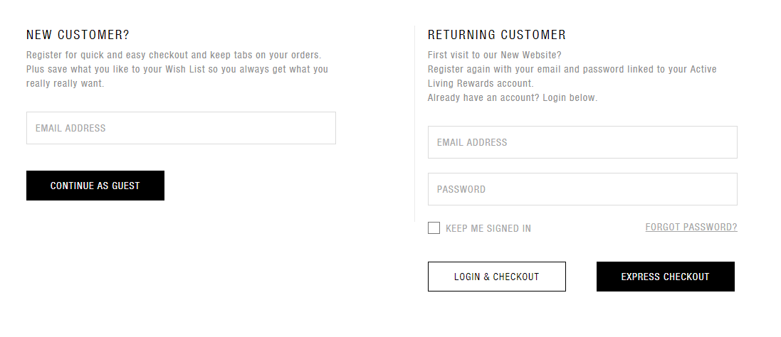
The layout is minimal and spacious, plus the bright pink makes the key information pop. A guest checkout is easily distinguished and made available by simply adding your email address in when prompted.
Lorna Jane’s lovers also get:
- A wide variety of payment methods offered, including Afterpay
- Order summary in the right-hand column with large product pictures
- An uncluttered 3 step checkout, displaying the current stage at all times
- Promo code field directly below products at all times
These examples highlight some of the key user interface and user experience features that take an average shopping cart and turbocharge it into a registered sales-boosting machine.
Here are your conversation starters for the next shopping cart chat with your web designer/marketing manager/business partner/yourself in the shower:
- Avoid compounding an already complex decision-making process further with excess visual clutter
- Restricting payment methods restricts payments
- Is the order total visible at all times during the checkout process?
- Each click or field to fill is another perceived barrier
- Offering repeat order refills at specified intervals saves customers time and worry
- If free shipping is offered over a certain amount, calculate it automatically for the customer
